NYC Council districts and city agencies – mapping the under-served
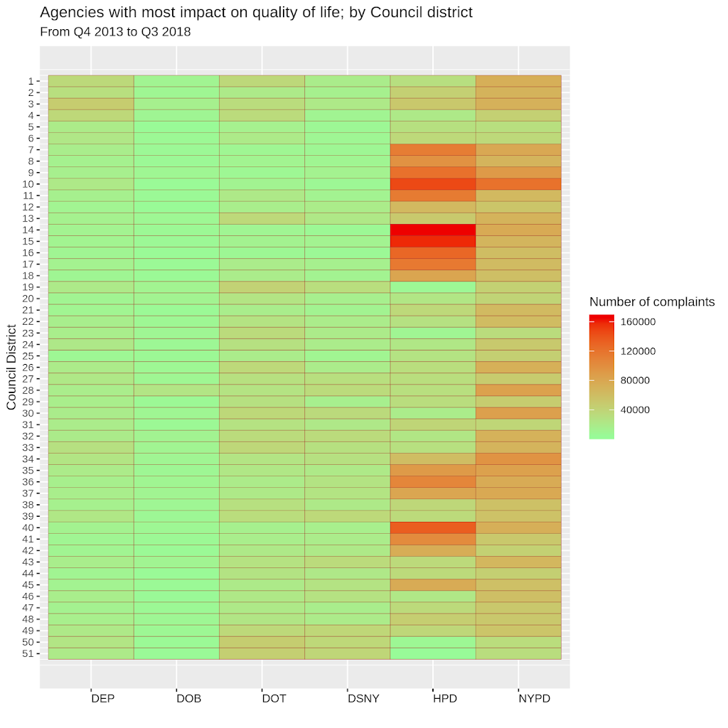
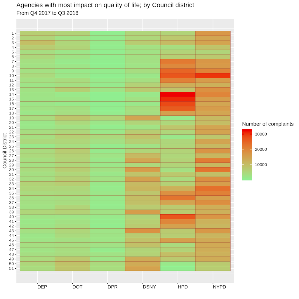
This graphic presents the six agencies that handled the most complaints to 311 over the five years from the fourth quarter of 2013 to the third quarter of 2018. And divides them up by the council district to which they pertain. There were a total of 10.7 million complaints to 311 during this period. They were handed off by 311 to 19 different agencies to resolve. Included in this graph are the six agencies that handled 9.6 million, or 90%, of those complaints. The second graphic looks only at the year from Q4, 2017 to Q3, 2018. If you had a quality of life issue in New York city, its resolution likely involved one of these agencies. Not sure quite how to read this graphic? Scroll down past it for an explanation.

How to read this ‘heatmap’
The number on the left each row represents a council district number. The six cells in a row represent city agencies, in order, the departments of Environmental Protection (DEP), Buildings (DOB), Transportation (DOT), Sanitation (DSNY), Housing Preservation & Development (HPD), and the NYPD. The color in a cell represents the number of complaints to that department from that district. The legend on the right, that looks like a temperature scale, shows the relative number of complaints, with a green representing fewer, and red representing the most number of complaints. The color in the DEP cell for district 1 seems to be around 40,000. The actual number happens to be 35,250.
This ‘heatmap’ helps to visually assess problem areas across districts and within districts. If you live in a district with a brilliant red cell, at a glance you know that is major problem. If it’s red on a five year chart, you know it’s a long-standing problem. The same heatmap suggests that your council member can gain points with constituents by focusing more attention on issues handled by that agency. Color-coding also makes it easier to spot the relatively more under-served council districts of NYC. The constant factor across all districts are council members – we all have one. Unlike the mayor, council members are more accessible. The effectiveness of council members in improving quality of life for their constituents may not be directly quantifiable, but these metrics can be used as a reasonable proxy of performance? I’d be interested to hear why not.
Below is a similar graphic for the year from October 1, 2017 to September 30, 2018. The agencies involved are the same as above, except the department of Buildings drops out and is replaced by Parks & Recreation (not a TV show!). Check back in early January for the 2018 report.

311 data from NYC Open Data. Parsed in RStudio v1.1.453 on R v3.3.3


