NYC Public Advocate candidates: their council district performance – part 1
Four members of the NYC Council and one former member are running for the job of Public Advocate on February 26, 2019. Aside from a host of others; apparently “everybody run for any office in sight” seems to be the trend du jour. I decided to see what I could find on the performance of the candidates as council members, as revealed in the quality-of-life metrics of NYC’s 311 data. The five, with their districts in parentheses, are Eric A. Ulrich (32) Jumaane D. Williams (45), Rafael L. Espinal Jr. (37), Ydanis Rodriguez (10) and Melissa Mark-Viverito who represented district 8 till she was term-limited at the end of 2017. Rafael Espinal Jr. was elected to the council end of 2013.
What the ‘resolution rate’ represents is the percentage of complaints to 311 that were resolved by the city and its agencies in a way that says they “fixed” the problem that the constituent was complaining about. The premise behind this blog post is the question: does a city council member make a difference to the quality of life in their district? The cynical answer is that elected officials make no difference, but the assumption has to be that the more effective ones do make a difference to their constituents’ lives.
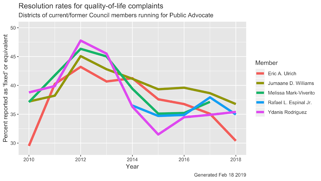
What’s in this graph? The percentage of service requests that were reported as ‘fixed’ (or can be interpreted as fixed) for the district during their tenure as council member. You will see a shorter line for Mr Espinal Jr. starting in 2014 and for Ms Mark-Viverito whose term ended 2017. So how did these five candidates do? Did they make a difference to their districts? Like a well-contested election – seems to be a lot of things happening all over the graph, but nothing clearly discernible that says definitively that one was better than the others in serving their district. So let’s cut out some of the zigs and zags and look at a smoothened line and see if we fare any better:
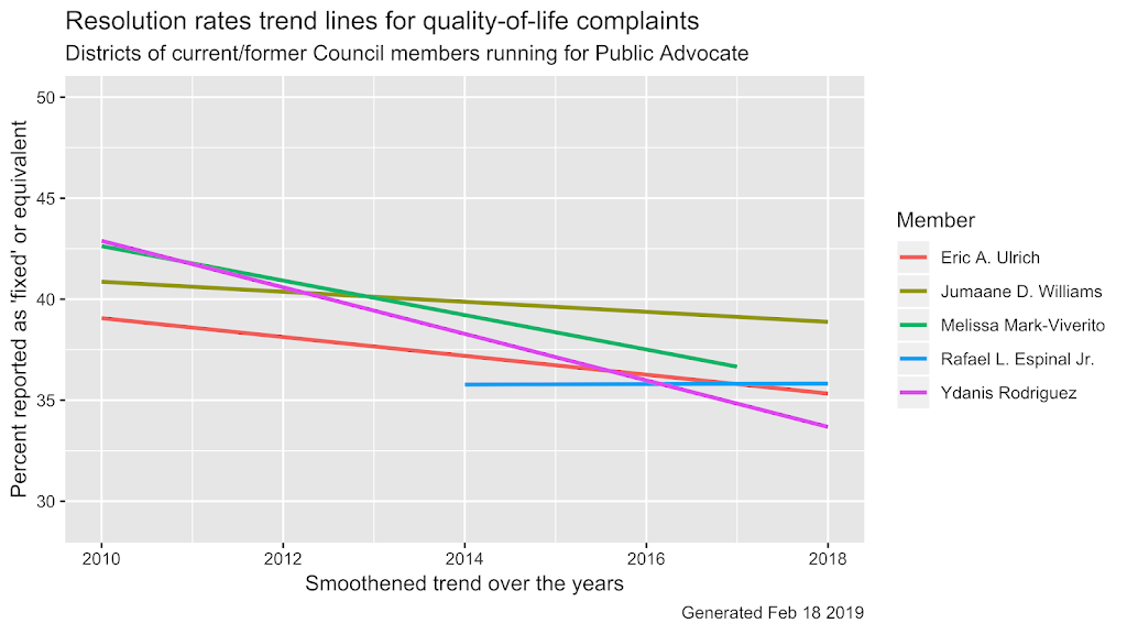
They all seem to have done better at the start of their terms (Ms Mark-Viverito’s line here only shows her 2nd and 3rd terms in the Council). And they all seem to decline gradually (Mr Williams) or sharply (the other three). Mr Espinal Jr.’s district seems to have held steady over the last 5 years. The only one to do so. With 4 out of 5 districts showing a deterioration, the conclusion must be that elected officials do not make a difference to their constituents’ lives? Not necessarily so.
What we have seen so far is a comparison of five candidates, five council districts rather, with each other. If the bigger trend is that the whole world is going to hell in a hand-basket, then surely we would see a majority of districts also showing that trend?
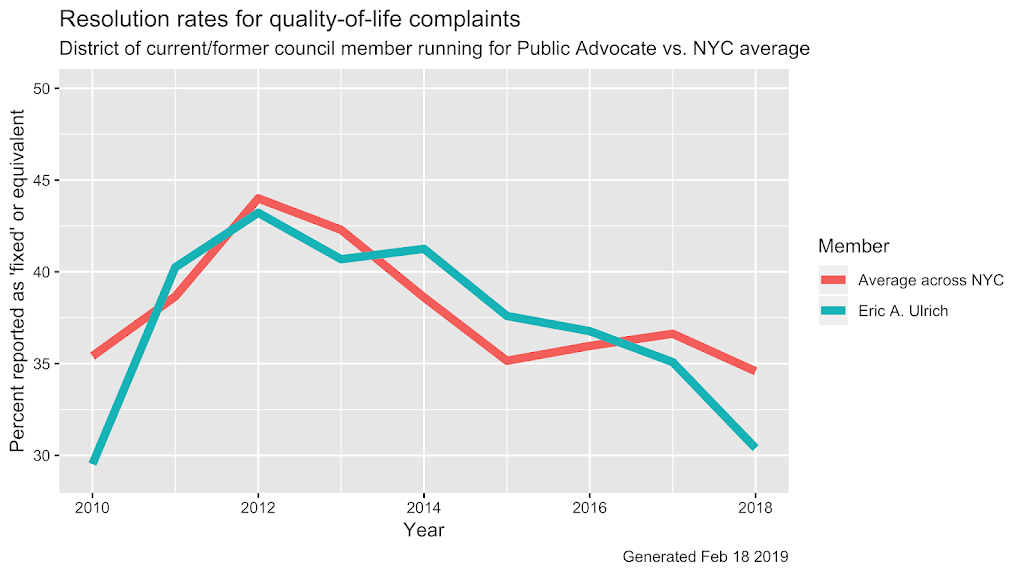
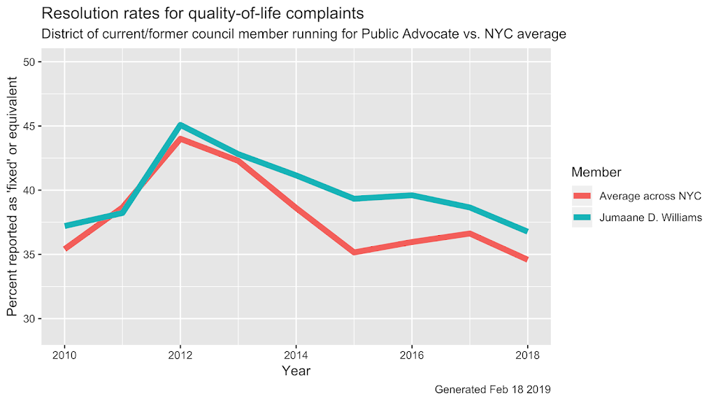
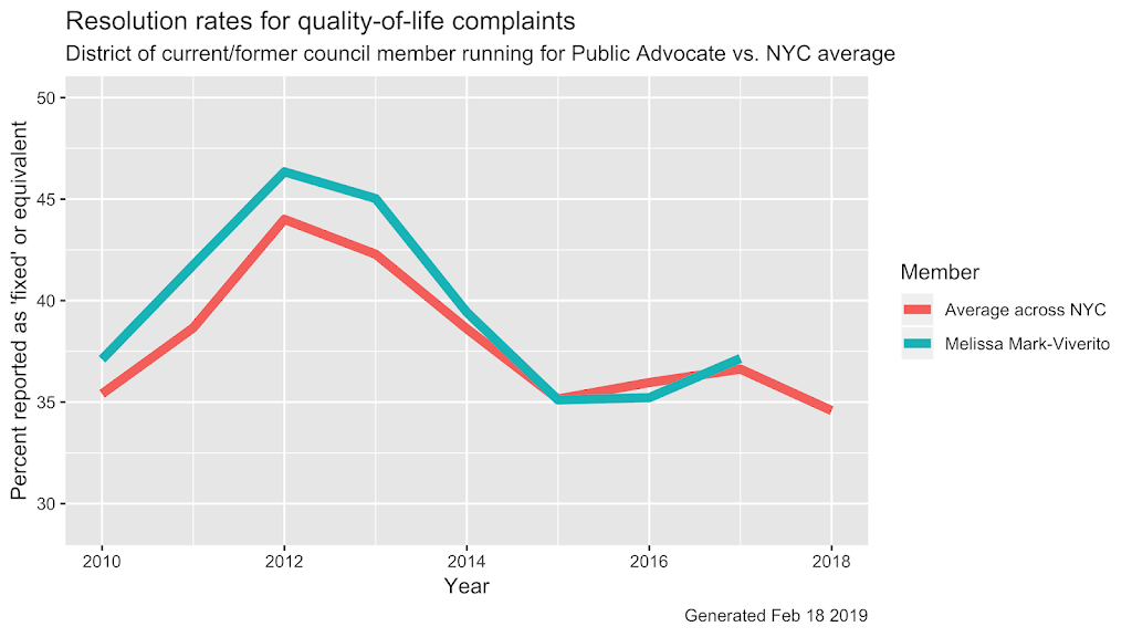
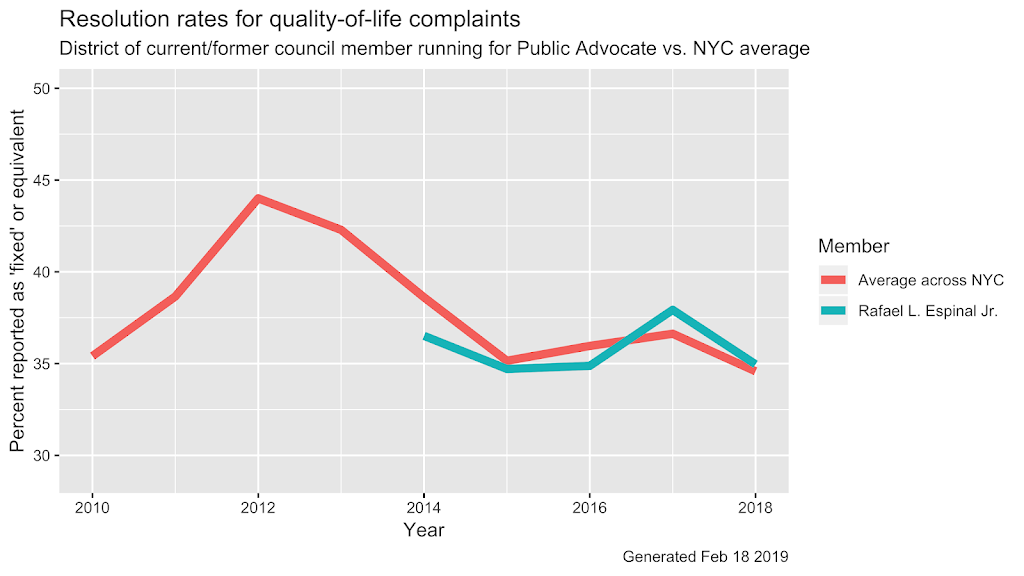
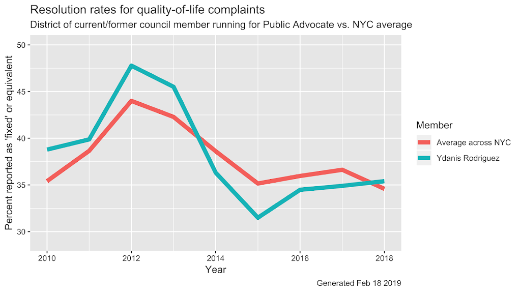
So let’s compare each of the districts these candidates represent (or recently represented) with the average rate for NYC as a whole – on average, what percent of service requests were reported as ‘fixed’ or ‘solved’ etc.? For this one, we are not going to add a sixth line to an already crowded graph – it gets too messy. We are instead going to compare each candidate’s district with the average for the city as a whole. And what does this do? With some luck we get to see if an elected official makes a difference. An effective representative should be able to chivvy city agencies and get in their hair to the point where positive results/outcomes in their district are higher than the city-wide average. That’s the whole point of averages – you generally want more than the average of good things in your ‘hood. And less than the average of things like murder, mayhem, border walls, and stop-and-frisks. And here they are in alphabetical order (by first name) – who is doing better or worse than the average:
311 data from NYC Open Data


