NYC: mapping the under-served by council district 2014-2018

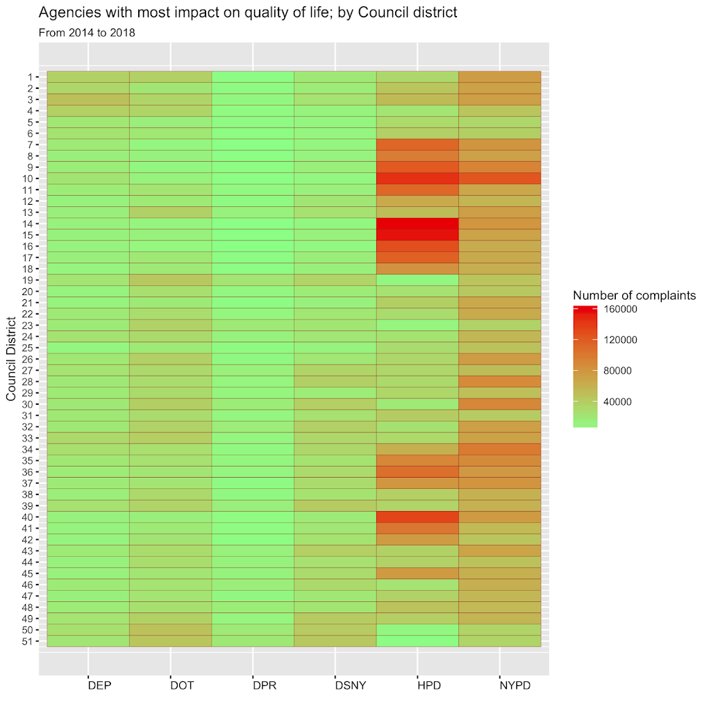
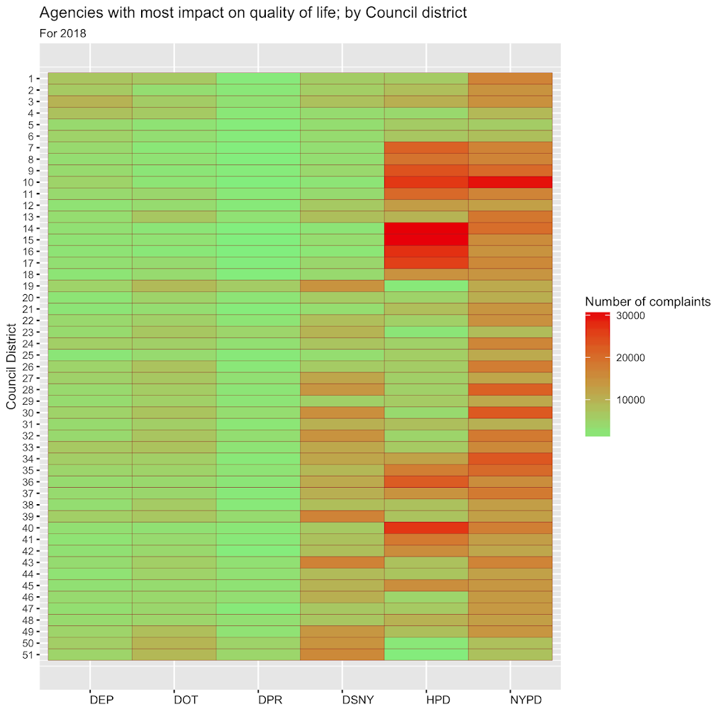
This graphic shows the six agencies that handled the most complaints called in to 311 over the five years from 2014 through 2018. And groups them to by council district. There were a total of 10.9 million complaints to 311 during this period. They were handed off by 311 to 19 different agencies to resolve. Included in this graph are the six agencies that handled 9.8 million, or 90%, of those complaints. If you had a quality of life issue in New York city, its resolution likely involved one of these agencies. Not quite sure how to read this ‘heatmap’? Scroll down past the first graphic for an explanation. The second graphic is similar, but covers only the year 2018.

How to read this ‘heatmap’
The number on the left of each row represents the council district. The six columns represent city agencies, in order, the departments of Environmental Protection (DEP), Transportation (DOT), Parks & Recreation (DPR), Sanitation (DSNY), Housing Preservation & Development (HPD), and the NYPD. The color in a cell represents the number of complaints from the district handed off to that department to resolve. The legend on the right, that looks like a temperature scale, shows the relative number of complaints. Green represents fewer, and red represents the most number of complaints.
These heatmaps help identify problem areas across council districts and within your own district. If you live in a district with a brilliant red cell, at a glance you know that is a problem. If it’s red on a five year chart, you know it’s a long-standing quality of life problem that is likely not getting the attention it deserves. A long-term heatmap makes it easy to spot the relatively more under-served council districts of NYC. Since it is a relative scale, there will always be red cells. In an ideal world, the red cells in a yearly chart would move around randomly and not be almost identical to a five year chart. If your district is a bright red for, say, HPD, last year and also the last five years, you may be looking at a problem that is not being addressed.
Below is a similar graphic for the year 2018. The agencies involved are the same as above.

311 data from NYC Open Data.

